Introduction
Color is one of the most important customization decisions in an OEM stainless steel travel mug project. For many customers, color is the first thing they notice before they evaluate the lid, capacity, material, insulation performance, or packaging.
A travel mug in the right color can immediately communicate brand identity, lifestyle positioning, seasonal relevance, and product value. A travel mug in the wrong color may look generic, outdated, or disconnected from the target market.
For B2B buyers, Pantone color customization is not just about making a product “look nice.” It affects:
- Brand consistency
- Retail shelf appeal
- Online click-through rate
- Gift suitability
- Product differentiation
- Campaign recognition
- Customer perception
- Inventory planning
- Production cost
- MOQ
- Lead time
This is why color selection should be treated as a strategic product decision, not a final decoration step.
For brands, retailers, Amazon sellers, promotional product companies, corporate gift buyers, and private label businesses, Pantone color matching helps create stainless steel travel mugs that look consistent with the brand’s visual identity and target audience.
In this guide, we will explain how Pantone color customization works, how brands should choose colors for stainless steel travel mugs, what factors affect color results, and how B2B buyers can reduce risk before placing bulk OEM orders.
What Is Pantone Color Customization?
Understanding Pantone Colors
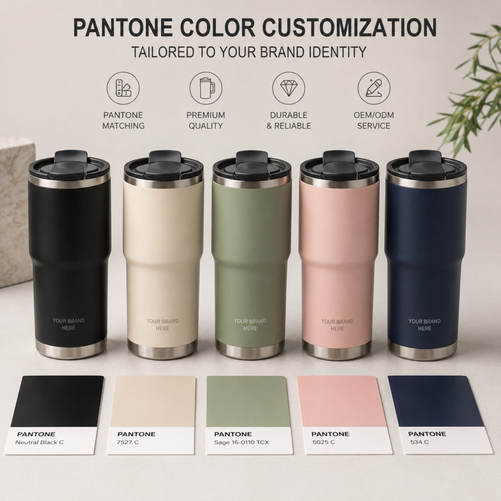
Pantone is a standardized color matching system used by designers, manufacturers, printers, and brands to communicate color accurately.
Instead of saying “light blue” or “dark green,” a buyer can provide a specific Pantone code. This helps reduce misunderstanding between the brand, designer, and manufacturer.
For example:
- “Pink” may mean many different shades.
- “Pantone 705 C” gives a much clearer color reference.
- “Navy blue” may look different on every screen.
- A Pantone code gives the factory a more precise target.
In OEM travel mug projects, Pantone color customization usually means the manufacturer adjusts the coating color, plastic part color, logo color, or packaging color to match the buyer’s required Pantone code as closely as possible.
Why Pantone Matching Is Important for Brands
Brand color consistency is important because customers recognize brands visually.
If a brand uses a specific blue on its website, packaging, product labels, and advertisements, the travel mug should ideally match that same brand color.
Inconsistent colors can make a product line look unprofessional.
For example, if a wellness brand uses a soft sage green across its website and packaging, but the actual travel mug arrives in a bright green, the product may feel disconnected from the brand image.
Pantone matching helps brands maintain consistency across:
- Product body color
- Logo printing color
- Lid color
- Straw color
- Packaging design
- Insert cards
- Labels
- Marketing photos
For private label products, this consistency is especially important because it makes the product feel like a real branded collection instead of a generic item.
Pantone Matching vs Standard Factory Colors
Buyers usually have two options: standard factory colors or customized Pantone colors.
Standard factory colors are existing colors that the manufacturer already offers. They are usually faster, more cost-effective, and easier to produce.
Pantone customized colors are matched based on the buyer’s required color code. They offer better brand consistency but may require higher MOQ, additional sampling time, and stricter color approval.
Standard colors are suitable for:
- Budget-sensitive projects
- Fast delivery orders
- Simple promotional campaigns
- First-time market tests
- Small seasonal trials
Pantone colors are better for:
- Private label brands
- Retail product lines
- Corporate brand campaigns
- Long-term product collections
- Premium gift projects
- Brand-specific color systems
For new buyers, standard colors may be a practical starting point. For established brands, Pantone matching is often worth the extra planning because it strengthens brand identity.
Why Color Selection Matters for Stainless Steel Travel Mugs
Color Defines Product Positioning
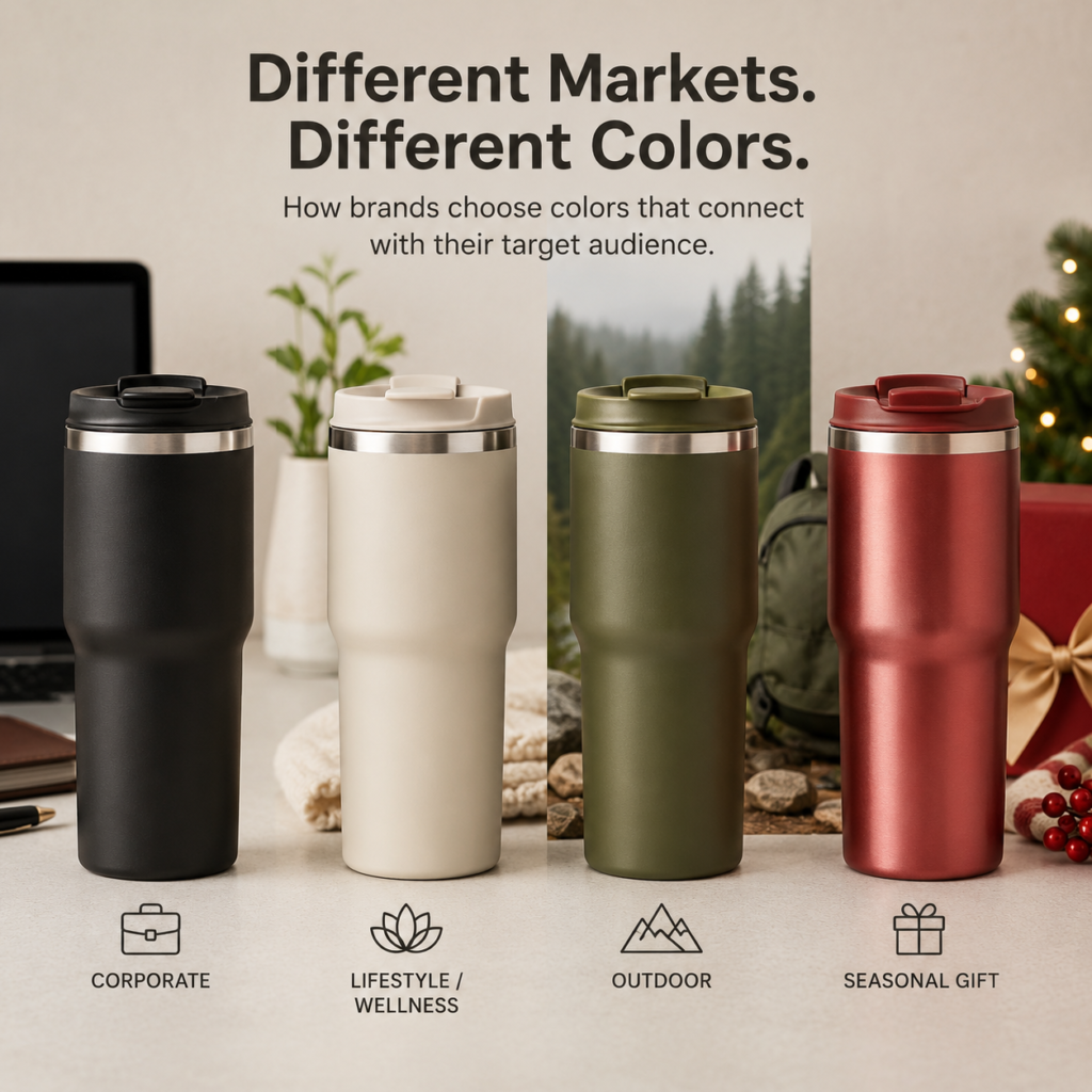
The same travel mug can target different markets simply by changing color.
For example:
- Matte black creates a professional and premium feeling.
- Cream white feels soft, clean, and lifestyle-oriented.
- Pastel pink feels suitable for female gift markets.
- Olive green feels outdoor and natural.
- Metallic gold feels festive and premium.
- Bright orange feels sporty and energetic.
This means color helps define whether the travel mug is positioned as:
- Corporate gift
- Lifestyle accessory
- Retail gift product
- Outdoor travel mug
- Fitness drinkware
- Premium coffee mug
- Seasonal promotional item
Before choosing colors, buyers should ask: “What market should this mug serve?”
Color should support the product’s positioning, not conflict with it.
Color Influences Customer Emotion
Color affects how customers feel about a product.
Soft colors may feel calm and elegant. Bright colors may feel energetic and playful. Dark colors may feel professional and durable. Metallic colors may feel premium and festive.
For stainless steel travel mugs, emotional response is especially important because many buyers use them in personal daily routines such as coffee drinking, commuting, office work, travel, and gifting.
A customer may choose a travel mug because it matches their lifestyle aesthetic.
This is why DTC brands and retail brands often invest heavily in color planning. A good color lineup can make a product more desirable even if the shape is simple.
Color Affects Online Conversion
For e-commerce sellers, color strongly affects product photos and click-through rate.
A travel mug in a visually attractive color may perform better in:
- Amazon listings
- Shopify product pages
- Instagram ads
- TikTok videos
- Pinterest images
- Lifestyle photography
Colors that photograph well often help products stand out in crowded online marketplaces.
Examples include:
- Cream beige for minimalist lifestyle photos
- Gradient pink-purple for social media appeal
- Matte black for premium professional images
- Sky blue for summer campaigns
- Rose gold for gift-oriented listings
For online brands, color selection should be made with product photography in mind.
Color Affects Inventory Risk
Color can improve sales, but it can also create inventory risk.
Some colors are stable and sell year-round. Others are seasonal or trend-driven.
Core colors such as black, white, navy, gray, and stainless steel silver usually have lower risk because they appeal to broad audiences.
Trend colors such as lavender, coral, lime green, or gradient finishes may sell well during specific campaigns but may become slower-moving after the season.
For B2B buyers, a good color strategy should balance:
- Core colors for stable demand
- Seasonal colors for campaign relevance
- Trend colors for differentiation
- Limited colors for testing
Popular Pantone Color Directions for Stainless Steel Travel Mugs
Neutral Colors for Corporate and Professional Markets
Neutral colors are the safest choice for business-oriented travel mugs.
Popular neutral colors include:
- Matte black
- White
- Gray
- Navy
- Stainless steel silver
- Cream
- Beige
These colors work well because they are easy to match with logos and packaging.
Best use cases:
- Corporate gifts
- Employee gifts
- Conference giveaways
- Professional retail products
- Premium coffee mugs
- Office drinkware
For example, a matte black stainless steel travel mug with laser engraving can look highly professional and suitable for corporate clients. A cream white travel mug with subtle logo printing can work well for lifestyle or wellness brands.
Neutral colors are ideal for buyers who want lower inventory risk and long-term sales potential.
Pastel Colors for Lifestyle and Gift Markets
Pastel colors are popular in lifestyle, wellness, female-focused, and gift markets.
Common pastel options include:
- Pastel pink
- Lavender
- Mint green
- Soft blue
- Peach
- Cream beige
- Light yellow
These colors feel soft, warm, and visually pleasing.
Best use cases:
- Mother’s Day gifts
- Valentine’s Day campaigns
- Lifestyle brands
- Coffee mug collections
- Beauty and wellness promotions
- Female travel products
- DTC brand launches
Pastel travel mugs often perform well in social media content because they create a clean and aesthetic visual style.
For brands targeting younger consumers, female audiences, or gift shoppers, pastel Pantone customization can improve emotional appeal.
Bright Colors for Sports and Seasonal Campaigns
Bright colors create energy, visibility, and excitement.
Popular bright colors include:
- Orange
- Lime green
- Bright blue
- Yellow
- Red
- Turquoise
- Coral
Best use cases:
- Summer campaigns
- Sports promotions
- Outdoor events
- Gym merchandise
- Youth markets
- Trade show giveaways
Bright travel mugs are highly visible and can help brands stand out during events or online promotions.
However, bright colors should be used carefully. They may not fit premium or corporate positioning. They are stronger for campaign-based products, sports brands, or seasonal retail lines.
Earth Tones for Outdoor and Eco-Friendly Brands
Earth tones are increasingly popular in outdoor, travel, and sustainability-focused markets.
Common earth tones include:
- Olive green
- Sand
- Clay
- Terracotta
- Forest green
- Stone gray
- Brown
- Warm beige
These colors create a natural and grounded feeling.
Best use cases:
- Outdoor travel mugs
- Camping drinkware
- Eco-friendly campaigns
- Sustainable lifestyle brands
- Father’s Day outdoor products
- Premium nature-inspired collections
Earth tones pair especially well with kraft packaging, minimalist logos, and matte finishes.
For brands that want to communicate sustainability, natural lifestyle, or outdoor durability, earth-tone Pantone customization is a strong option.
Metallic Colors for Premium and Holiday Products
Metallic colors create a premium and festive impression.
Popular metallic options include:
- Gold
- Silver
- Rose gold
- Champagne
- Copper
- Gunmetal
Best use cases:
- New Year campaigns
- Christmas gift sets
- Premium corporate gifts
- VIP client gifts
- Luxury-style retail products
- Holiday travel mug collections
Metallic colors can increase perceived value, especially when paired with gift packaging.
However, buyers should pay close attention to coating quality because scratches, fingerprints, and uneven finish may be more noticeable on metallic surfaces.
Gradient Colors for E-Commerce and Trend-Driven Markets
Gradient colors are popular in online marketplaces and lifestyle product lines.
Common gradient combinations include:
- Pink to purple
- Blue to green
- Orange to yellow
- Purple to blue
- Sky blue to white
- Sunset gradient
- Green to blue
Gradient travel mugs have strong visual impact and often photograph well.
Best use cases:
- Amazon listings
- Shopify stores
- Social media campaigns
- Summer collections
- Youth markets
- Gift products
- Limited edition launches
Gradient finishes may require more production control than solid colors. Buyers should request physical samples before confirming bulk production.
How Brands Should Choose Pantone Colors
Start with Brand Identity
The first step is to review the brand’s existing color system.
Buyers should ask:
- What are the official brand colors?
- Are Pantone codes available?
- Does the product need to match packaging?
- Does the mug need to match website and social media visuals?
- Is the product part of a larger collection?
If the brand already has official Pantone colors, those should be the starting point.
For corporate projects, brand color accuracy is often very important. A company ordering travel mugs for employees or clients usually expects the product to match its brand guidelines.
Consider the Target Audience
Different audiences respond to different color styles.
Corporate clients may prefer:
- Black
- Navy
- Gray
- Silver
- White
Female lifestyle customers may prefer:
- Cream
- Pastel pink
- Lavender
- Beige
- Rose gold
Outdoor users may prefer:
- Olive
- Sand
- Forest green
- Matte black
- Terracotta
Kids or youth markets may prefer:
- Bright blue
- Yellow
- Purple
- Pink
- Green
Choosing colors based on the end user improves product-market fit.
Match the Sales Channel
Color strategy should also match where the product will be sold or used.
For retail stores, shelf appeal is important. Colors should stand out but still feel organized as a product line.
For e-commerce, colors should photograph well and attract clicks.
For corporate gifts, colors should feel professional and logo-friendly.
For promotional campaigns, colors should match the campaign theme and event message.
For Amazon sellers, it is often best to combine stable core colors with one or two visually distinctive colors to improve listing appeal.
Plan Colors by Season
Seasonality is important for stainless steel travel mugs, especially in gift and promotional markets.
Suggested seasonal color directions:
- Spring: mint, lavender, peach, cream, light blue
- Summer: sky blue, orange, yellow, turquoise, coral
- Mother’s Day: pastel pink, cream, rose gold, soft purple
- Father’s Day: matte black, navy, army green, gunmetal
- Valentine’s Day: red, pink, rose gold, cream
- Christmas: red, green, gold, white, dark blue
- New Year: black, gold, silver, champagne
- Back-to-school: bright blue, yellow, purple, pink
Seasonal colors help products feel timely and campaign-ready.
Use Core Colors and Accent Colors
A practical color lineup should include both core and accent colors.
Core colors are stable year-round options. Accent colors are seasonal, trend-driven, or campaign-specific.
For example, a stainless steel travel mug line may include:
- Core colors: black, white, navy
- Lifestyle color: cream
- Seasonal color: pastel pink
- Limited edition: rose gold
This structure gives buyers both stability and freshness.
For new brands, launching too many colors at once can create inventory pressure. A 3–5 color lineup is usually more manageable for the first order.
Pantone Color Customization Process
Step 1: Provide Pantone Code or Color Reference
The buyer should provide a specific Pantone code whenever possible.
Useful information includes:
- Pantone code
- Color reference image
- Brand guideline file
- Packaging artwork
- Logo color file
- Desired surface finish
- Target product material
Pantone codes are more reliable than screenshots or phone photos because screen colors vary.
If a buyer does not have a Pantone code, the supplier may help match the closest available color based on physical reference or digital artwork.
Step 2: Confirm Product Surface and Coating Type
The same Pantone color may look different depending on surface finish.
Factors include:
- Matte coating
- Glossy coating
- Powder coating
- Metallic finish
- Rubberized coating
- Stainless steel surface
- Plastic lid material
For example, Pantone pink on a matte powder-coated stainless steel body may look different from the same pink on a glossy plastic lid.
Buyers should confirm which parts need color matching:
- Mug body
- Lid
- Handle
- Straw
- Silicone ring
- Packaging
- Logo print
Each material may require separate color control.
Step 3: Make Color Sample
Before mass production, the factory should create a color sample or pre-production sample.
The sample helps confirm:
- Color accuracy
- Surface finish
- Logo contrast
- Coating texture
- Overall product appearance
- Packaging match
Buyers should review samples under natural light when possible because lighting can affect color perception.
For important brand colors, physical sample approval is highly recommended.
Step 4: Approve Logo and Color Combination
Color and logo must work together.
A common mistake is choosing a beautiful mug color but using a logo color that has poor contrast.
For example:
- White logo on cream mug may be too subtle.
- Black logo on navy mug may not be visible.
- Gold logo on metallic gold mug may lack contrast.
- Red logo on pink mug may look unclear.
Before bulk production, buyers should confirm that the logo is readable and visually balanced.
Step 5: Confirm Bulk Production Standard
After sample approval, the buyer and manufacturer should confirm the acceptable color standard for mass production.
This may include:
- Approved sample
- Pantone code
- Color tolerance
- Surface finish requirement
- Logo color requirement
- Packaging color reference
The approved sample should become the production reference.
Professional factories usually support Pantone color matching, logo customization, sampling, bulk production, and quality control for OEM stainless steel travel mug projects. Early sample approval helps reduce color mismatch risk before large-volume production.
Important Factors That Affect Pantone Color Results
Material Difference
Colors may appear different on stainless steel, plastic, silicone, and paper packaging.
For example, a cream color on powder-coated stainless steel may look warmer than the same color printed on a paper box.
This is normal because different materials absorb and reflect light differently.
Buyers should not expect every material to look exactly identical, but the overall color direction should remain consistent.
Surface Finish
Matte and glossy finishes create different visual effects.
Matte finish usually looks softer and more premium.
Glossy finish looks brighter and more reflective.
Metallic finish adds shine and depth.
Powder coating can create texture and improve grip.
When choosing Pantone colors, buyers should also choose the surface finish carefully because it affects the final appearance.
Lighting Conditions
Color can look different under different lighting.
A mug may look slightly different under:
- Natural daylight
- Office lighting
- Factory lighting
- Photo studio lighting
- Warm indoor lighting
- Online product photos
This is why buyers should review physical samples in consistent lighting and avoid judging color only from photos.
Screen Display Differences
Digital mockups are helpful, but screen colors are not fully reliable.
Different monitors, phones, and tablets may display colors differently.
Pantone codes and physical samples are more reliable for final approval.
Batch Consistency
In bulk production, color consistency across batches is important.
Potential issues include:
- Slight color variation between production runs
- Different coating batches
- Different material lots
- Reorders months later looking slightly different
- Lid color and body color mismatch
Buyers planning repeat orders should keep approved samples and confirm color standards before each production run.
Pantone Color Strategy by Buyer Type
For New Drinkware Brands
New brands should avoid launching too many colors at once.
Recommended strategy:
- Start with 3–5 colors
- Use 2–3 core colors
- Add 1 seasonal color
- Add 1 distinctive brand color
- Avoid too many custom Pantone colors in the first order
This helps reduce inventory risk and keeps production manageable.
For example:
- Black
- White
- Cream
- Pastel pink
- Olive green
This type of lineup can cover corporate, lifestyle, and seasonal demand without becoming too complex.
For Corporate Gift Buyers
Corporate buyers usually need brand color accuracy and professional presentation.
Recommended strategy:
- Use official brand Pantone colors if available
- Choose neutral mug body colors
- Use logo color with strong contrast
- Consider laser engraving for premium effect
- Match packaging with corporate identity
For corporate gifts, color should feel professional and reliable. Overly trendy colors may not be suitable unless they match the company’s campaign theme.
For Retail Brands
Retail brands need a balanced color lineup.
Recommended strategy:
- Use stable core colors for year-round sales
- Add seasonal colors for new collections
- Use limited edition colors to create urgency
- Match packaging and display design
- Track sales performance by color
Retail buyers should carefully monitor which colors sell fastest and which colors create inventory pressure.
For Amazon and E-Commerce Sellers
E-commerce sellers should choose colors that perform well in product images.
Recommended strategy:
- Use high-contrast colors for main listing images
- Include lifestyle-friendly colors
- Add one standout color to improve click-through
- Avoid too many similar shades
- Use color names that are easy for customers to understand
For example, “Cream White,” “Matte Black,” “Sage Green,” and “Rose Pink” are easier for customers to understand than overly technical color names.
For Promotional Product Companies
Promotional product companies need flexibility.
Recommended strategy:
- Offer standard factory colors for fast quotes
- Offer Pantone matching for brand campaigns
- Prepare color charts for customers
- Recommend cost-effective options
- Confirm MOQ per color early
Promotional buyers often work with different clients, so having both standard color and custom color options is important.
How Many Colors Should Buyers Order?
For First-Time Orders
For first-time OEM travel mug orders, 3–5 colors is usually a practical starting point.
A simple structure could be:
- 2 core colors
- 1 brand color
- 1 seasonal color
- 1 test color
This gives enough variety without creating too much inventory risk.
For Retail Product Lines
Retail product lines may use more colors, but they should still be planned carefully.
A balanced structure may include:
- 60% core colors
- 25% seasonal colors
- 15% trend or limited colors
Core colors should carry most of the volume because they are more stable.
For Corporate Orders
Corporate orders often use only one or two colors.
The focus is usually brand consistency, not variety.
Common choices:
- Brand color mug + logo
- Neutral mug + brand color logo
- Black mug + laser engraving
- White mug + corporate logo
For Seasonal Campaigns
Seasonal campaigns may use fewer but more targeted colors.
For example:
Christmas travel mug order:
- Red
- Green
- Gold
- White
Mother’s Day travel mug order:
- Pastel pink
- Cream
- Lavender
- Rose gold
Father’s Day travel mug order:
- Matte black
- Navy
- Army green
- Gunmetal
The goal is seasonal relevance, not broad year-round variety.
Color and Logo Matching Tips
Use Strong Contrast
Logo visibility is essential.
Good combinations include:
- White logo on black mug
- Black logo on white mug
- Gold logo on navy mug
- Silver logo on matte black mug
- Dark logo on cream mug
Weak combinations include:
- White logo on light beige mug
- Black logo on dark navy mug
- Red logo on pink mug
- Gray logo on silver mug
Buyers should check logo visibility before approving samples.
Match Logo Method with Color
Some logo methods work better with certain colors and finishes.
For matte dark colors, laser engraving often looks premium.
For bright colors, silk screen printing can provide strong visibility.
For colorful logos, UV printing may be better.
For full-surface designs, heat transfer or full-wrap printing may be more suitable.
Color and logo method should be chosen together.
Consider Packaging Color
The travel mug and packaging should look like one complete product.
Examples:
- Cream mug + kraft box
- Matte black mug + black/gold gift box
- Pastel pink mug + floral gift box
- Olive mug + natural kraft packaging
- White mug + minimalist retail box
Packaging color can reinforce the product’s positioning and improve perceived value.
Common Pantone Customization Mistakes to Avoid
Choosing Colors Only from Screens
Screen colors are not reliable enough for final production.
Buyers should use Pantone codes and physical samples whenever possible.
Ignoring MOQ Per Color
Custom colors may require MOQ per color.
For example, a factory may accept 1,000 pieces total only if the color structure is simple. But if the buyer requests five custom colors, MOQ or cost may change.
Buyers should confirm MOQ per color before finalizing the lineup.
Using Too Many Trend Colors
Trend colors can create attention, but they may not sell long-term.
New buyers should test trend colors in limited quantities before scaling.
Forgetting Logo Contrast
A beautiful mug color is not enough if the logo is hard to read.
Logo contrast should be checked during sample approval.
Not Keeping Approved Samples
Approved samples are important references for bulk production and repeat orders.
Buyers should keep physical samples for future comparison.
Changing Colors Too Late
Late color changes can delay production.
Once coating materials are prepared or production begins, changes may cause extra cost and lead time.
Pantone Color Checklist for OEM Travel Mug Buyers
Before Confirming Bulk Orders
Buyers should confirm:
- Target market
- Sales channel
- End user profile
- Brand Pantone codes
- Mug body color
- Lid color
- Straw or handle color
- Logo color
- Surface finish
- Packaging color
- MOQ per color
- Sample approval process
- Color tolerance
- Lead time impact
- Reorder color consistency
- Final approved sample
This checklist helps reduce color mistakes and improves OEM project efficiency.
FAQ
What is Pantone color customization for stainless steel travel mugs?
Pantone color customization means matching the travel mug body, lid, logo, or packaging to a specific Pantone color code provided by the buyer.
Can stainless steel travel mugs be customized in any Pantone color?
Many Pantone colors can be matched, but the final effect depends on material, coating method, surface finish, MOQ, and production feasibility. Physical sample approval is recommended.
Is Pantone matching more expensive than standard colors?
Usually yes. Custom Pantone colors may require additional sampling, coating preparation, higher MOQ, and longer lead time compared with standard factory colors.
What colors are best for stainless steel travel mugs?
Black, white, navy, gray, cream, and stainless steel silver are strong core colors. Pastels work well for lifestyle and gift markets. Earth tones work well for outdoor and eco-friendly brands. Metallic colors work well for premium gifts.
How many colors should a new brand launch?
For a first OEM order, 3–5 colors is usually a practical starting point. This helps balance variety and inventory risk.
Can the lid and mug body be different colors?
Yes. Many OEM projects use different colors for the body, lid, handle, straw, or silicone parts. However, each material may have different color matching limitations.
Why does the final color look slightly different from the Pantone card?
Color may vary due to material, surface finish, lighting, coating method, and production batch. This is why physical samples are important.
Can packaging also match the same Pantone color?
Yes. Packaging can be designed with matching Pantone colors, but paper printing and metal coating may look slightly different due to material differences.
Conclusion
Pantone color customization is a key part of creating successful OEM stainless steel travel mugs. It helps brands build visual consistency, improve product appeal, match seasonal campaigns, and differentiate in competitive markets.
The right color strategy should consider:
- Brand identity
- Target audience
- Sales channel
- Seasonality
- Product positioning
- Logo visibility
- Packaging design
- MOQ
- Lead time
- Inventory risk
Standard factory colors are practical for fast and cost-effective projects, while Pantone-matched colors are better for private label brands, retail collections, and corporate identity campaigns.
For new buyers, the safest approach is to build a balanced color lineup with core colors, one or two seasonal colors, and limited trend testing. For established brands, Pantone customization can strengthen product identity and create a more professional brand experience.
With proper sample approval, color control, and production planning, stainless steel travel mugs can become stronger, more attractive, and more market-ready products.
👉 Contact us for Pantone color matching, OEM stainless steel travel mug customization, logo printing, packaging design, and fast quotations for your next drinkware project.